
 When you’re decorating, there’s white (which you can buy as Resene White), and there is a slew of other whites or off-whites, with touches of yellow, green, brown or grey turning them to alabaster, chalk, ivory, cream.
Each variation can have a striking effect on your decor, so it’s important you choose the best shade to suit your interior design.
From warm tones to stark styles, white has a huge range of potential uses, and selecting the right white in your home can be difficult. With so many subtle shades and different temperatures to choose from, knowing which paint will best suit your walls takes an educated eye.
Fortunately, there are a few simple rules you can follow to ensure your rooms are painted the ideal shade of white. Here are four quick tips to help you choose the right white for each room in your home:
 Know the mood
There is a fine line between introducing a white into the bedroom that conjures up an atmosphere of rest and relaxation or painting your walls a sterile and bright shade. A good place to start when selecting whites is the temperature. Imagine brighter tones are like an ice-cold glass of water – drinking this is likely to perk you up and give you energy. In contrast, a warmer white is much like a mug of tea – less stimulating but very comforting.
Deciding what the room will be used for is perhaps the most important aspect of choosing the right shade of white. Depending on where you are painting, your white needs to reflect the purpose of the area. In bedrooms, for instance, a warmer, creamy hue may be best.
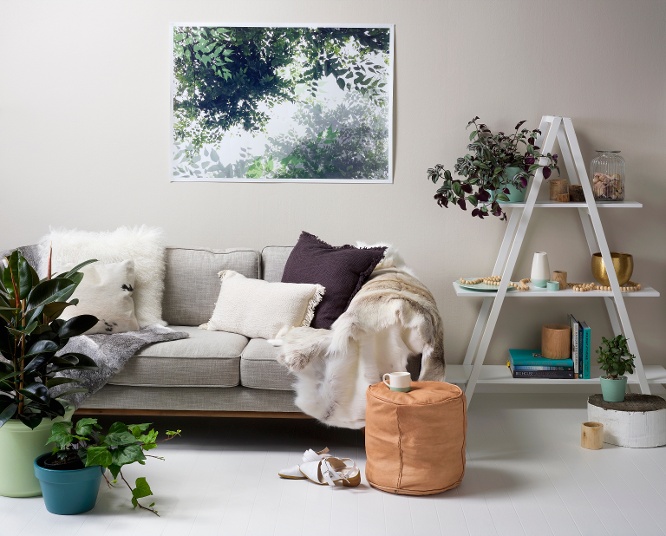
Selecting a white with yellow, brown or red undertones will project a cosy atmosphere and can be complemented with ivory-coloured bedding or contrasted against darker hues. For instance, a soft Resene Soapstone wall is paired well with the striking Resene Pohutukawa.
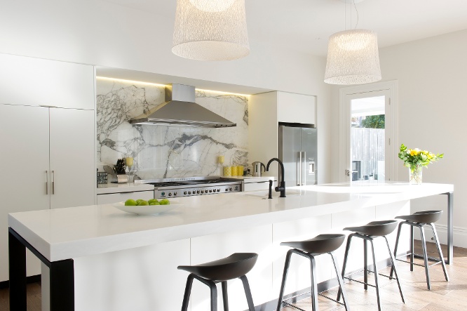
On the other hand, the cooler tones of blue-, grey- and green-based whites are better suited for areas where you and your family will be wide awake and active. Keeping people on their toes is made simple if you paint with a striking Resene Eighth Black White in your home.
Accessorise well
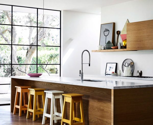
Whites and off-whites pick up on other elements in the room. If you have lots of greenery out the window, expect your walls to take on a green look. Use a strong blue rug or furniture, and your walls will pick up on that.
Complement the ceiling
If going for a white-based decor, don’t forget the ceiling. When your walls are painted in a neutral tone, the ceiling can become an integral part of the overall look and feel of a room.
An off-white used on the ceiling will look much darker than the same colour on a wall because there is less light reflected. Use a half strength of your wall colour on your ceiling for balance. The Resene “The Range Whites & Neutrals” collection has up to six strength variations of Resene’s most popular whites and off-whites so you can easily choose variations of the same colour.
Try, try, try again
It can be tricky to get colouring right the first time. Try a few Resene testpots on a large piece of A2 card leaving a border around the edge and then move from wall to wall at different times of the day and night to see what works best. By testing a variety of hues, you can train your eye to see the subtle differences during different times of the day. View the large A4 swatches of the paint colours at your local Resene ColorShop. Slip a piece of printer paper in between the samples – it will help you to see the underlying tone of each colour.
If you’re finding all your choices are clashing with your existing paintwork and it’s tricky to imagine going lighter, it can be a good idea to paint one coat of white over the entire surface. This will give you a clean slate so you can choose your new colour without the old colour distracting you.
Article taken from: www.cooperandco.co.nz
Leave a Comment